Hong Kong Spotlight
Art Basel HK

DESIGN
Concept
the artful
glow
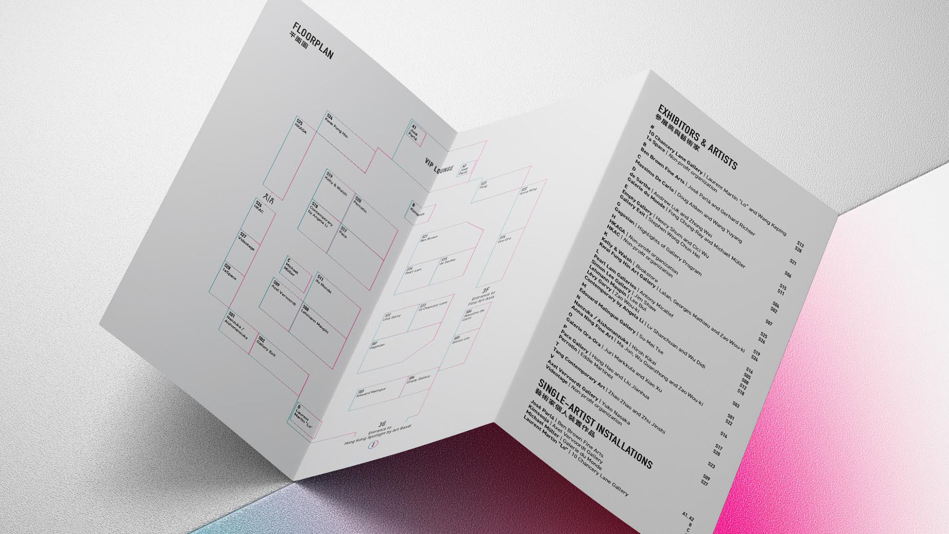
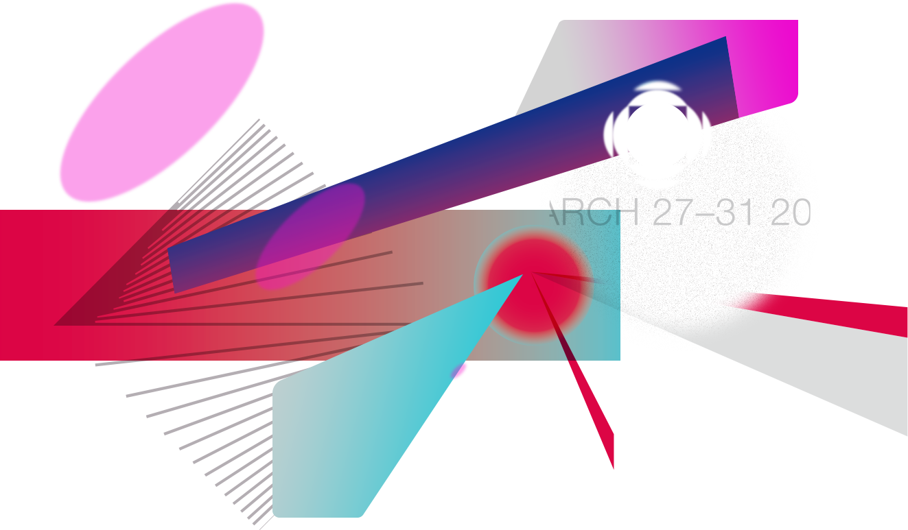
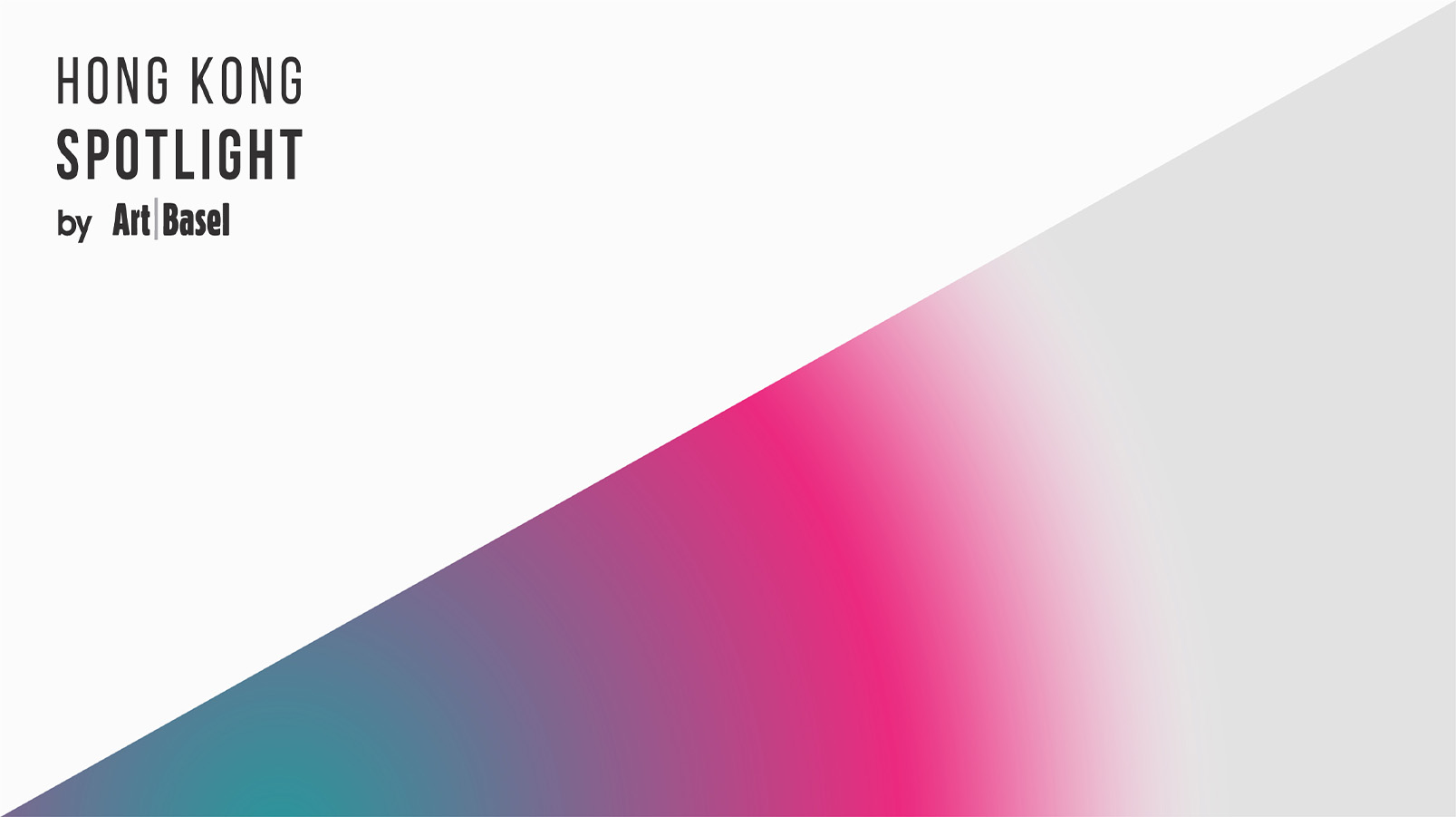
Inspired by the magenta of Art Basel Hong Kong, the branding design of Spotlight extends the same colour into a stylish ombré, captured in a directional angle to reflect the notion of spotlight, adapted into a full series of digital, printed and on-site items for an aligned brand experience.
LOGO
DESIGN

The logo design of Hong Kong Spotlight reflects the elongated nature of the Art Basel logo. Contemporary and bold, it holds the distilled nature of the minimalistic aesthetic, reflecting an aligned style and vision with the Art Basel mother brand.
Illuminating in
modernity &
brilliance
on the stage
Illuminating
in modernity
& brilliance
on the stage
THE PROCESS
KEY ART

Brand
Experience
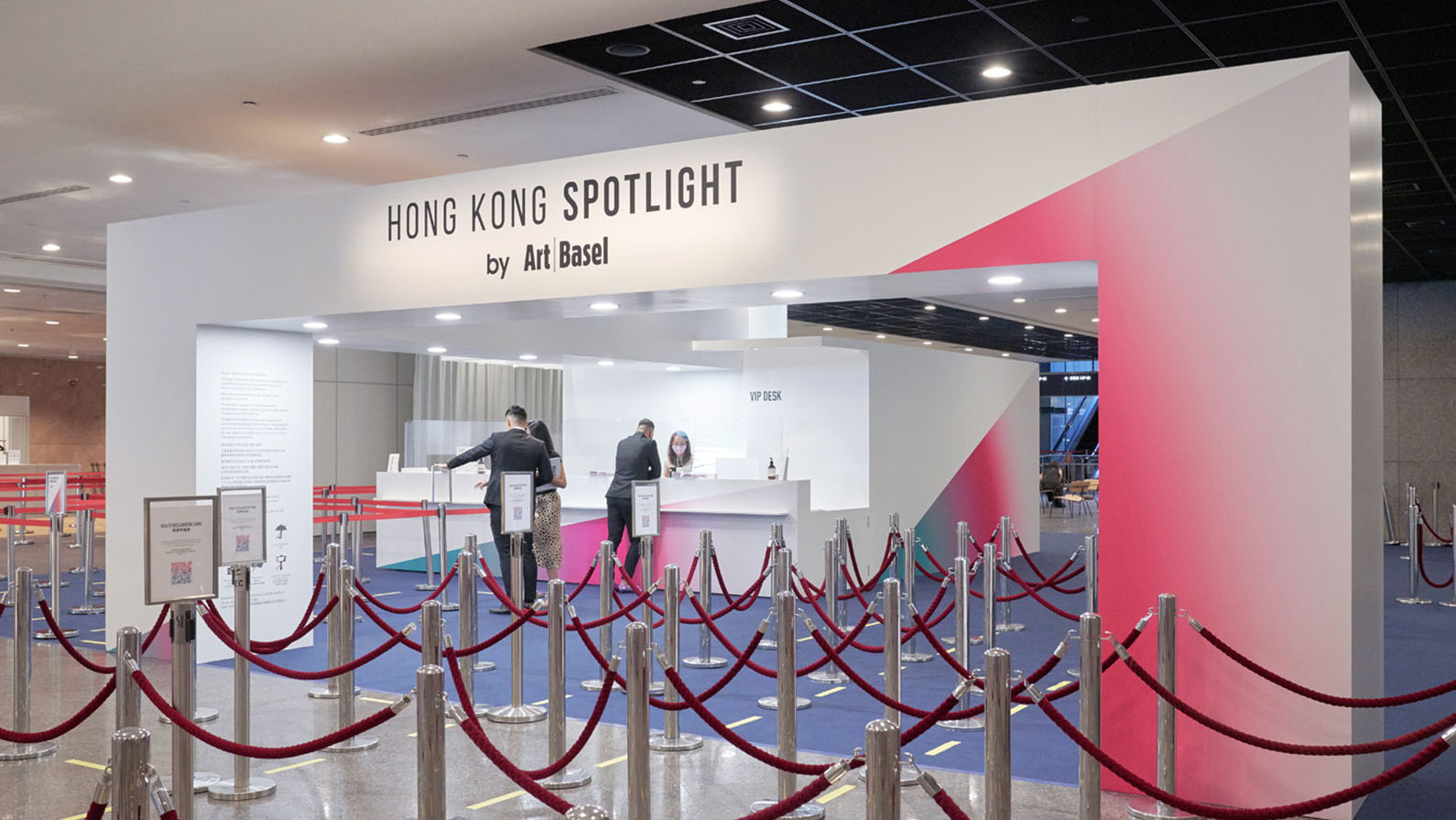
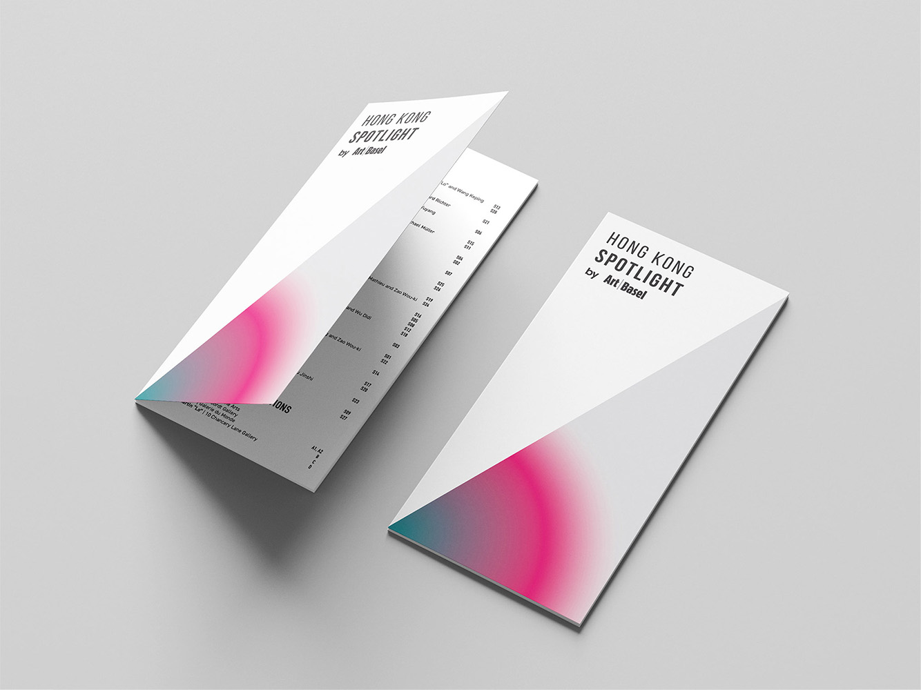
At the core of Spotlight’s branding is the notion of capturing attention and directing it towards the artistry and creativity that unfolds at Art Basel Hong Kong. The bold and energetic magenta ombré serves as a visual representation of the spotlight’s powerful beam, illuminating the extraordinary talent and innovation showcased within the art world.
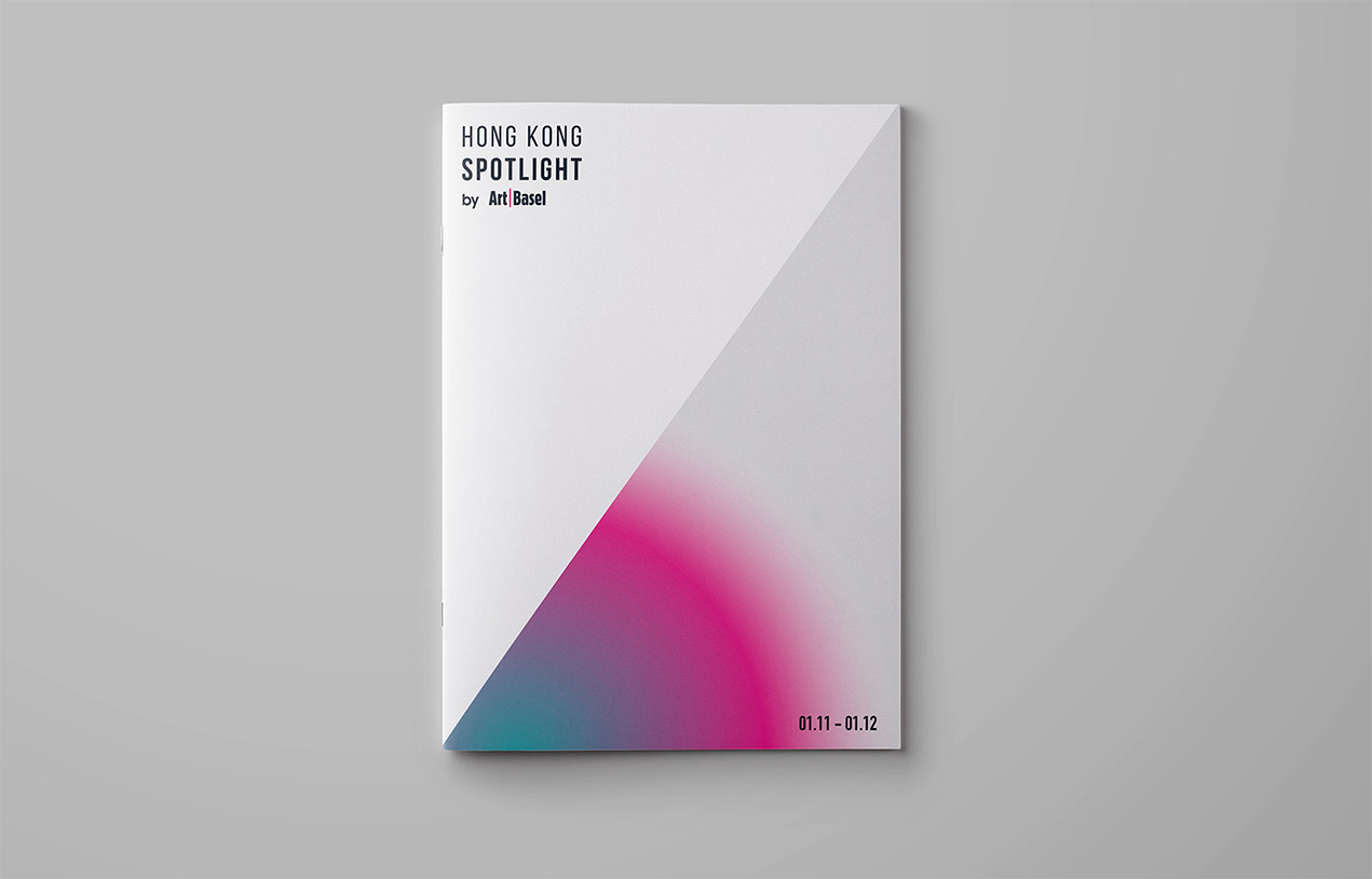
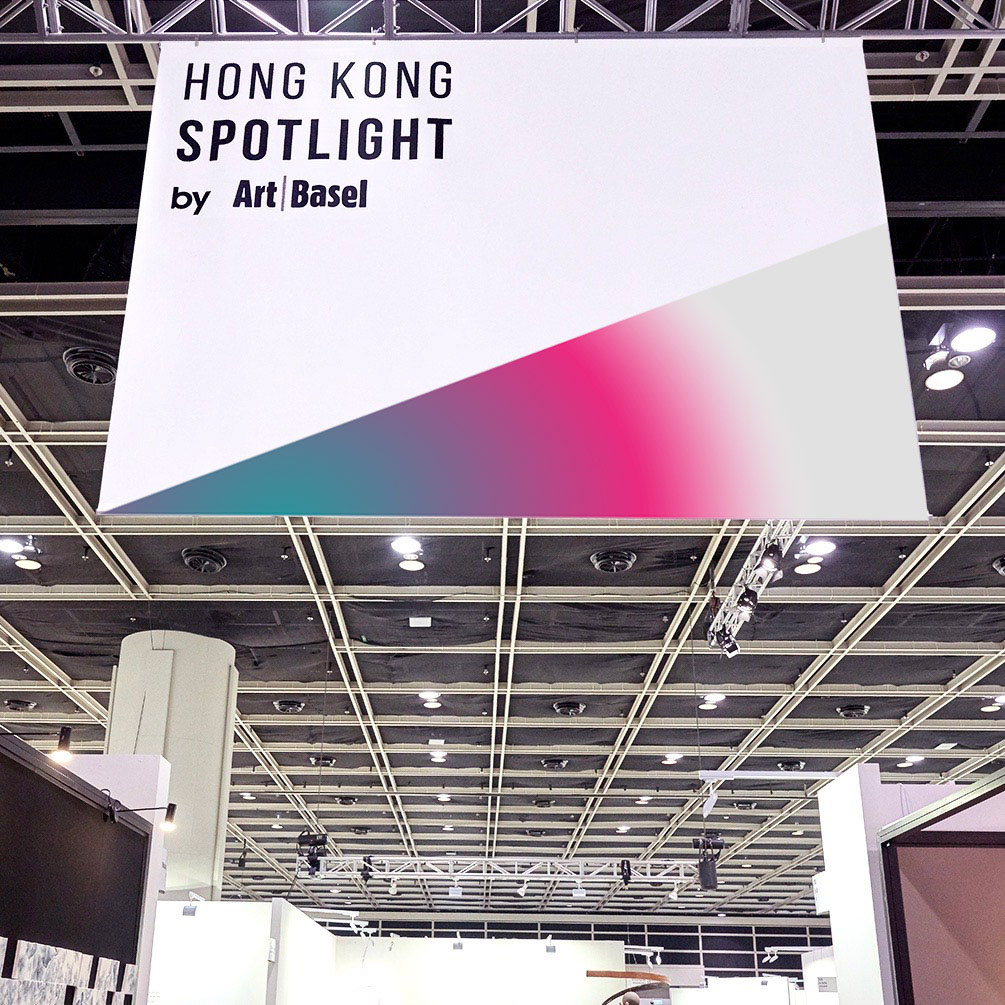
From signage and wayfinding elements to exhibition booths and installations, the magenta ombré creates a striking visual impact, guiding visitors and emphasizing the importance of each artistic creation.
