Here to Optimise You
LifeHub
DESIGN
Concept
UPWARD PATH
OF IMPROVEMENt
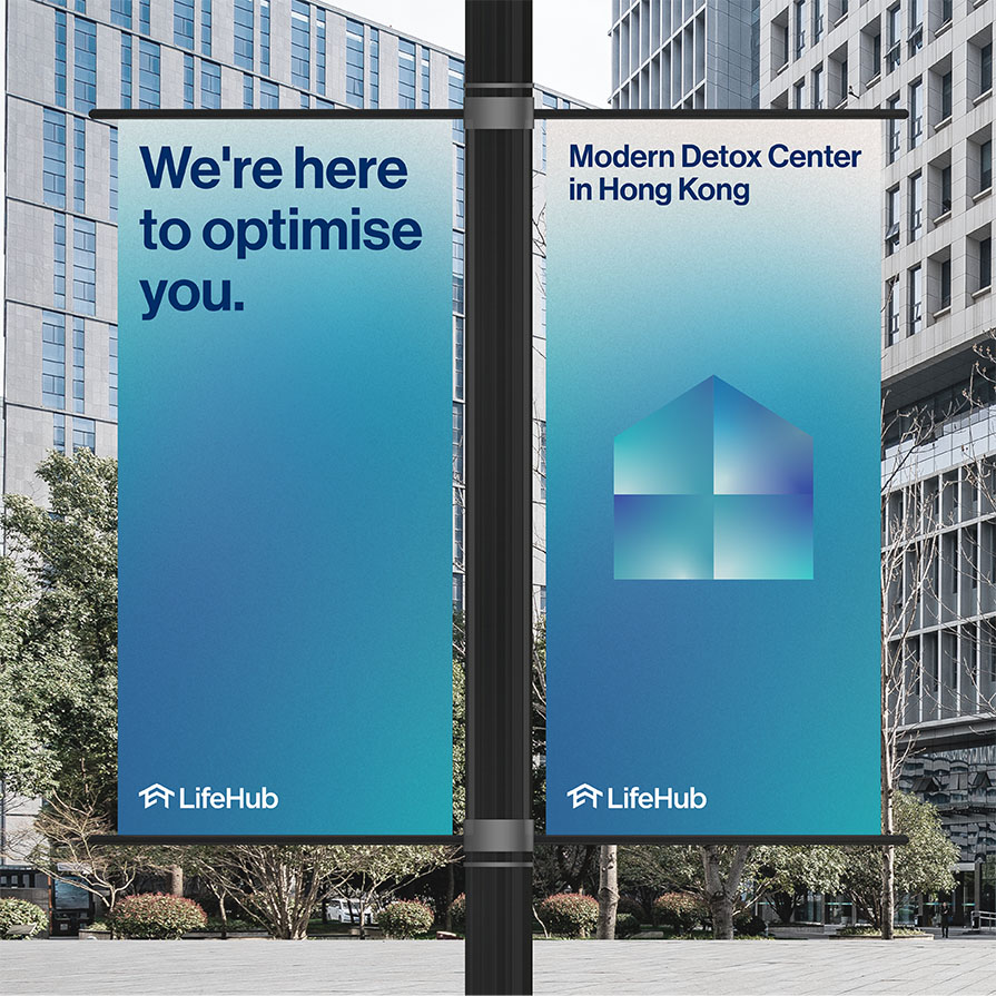
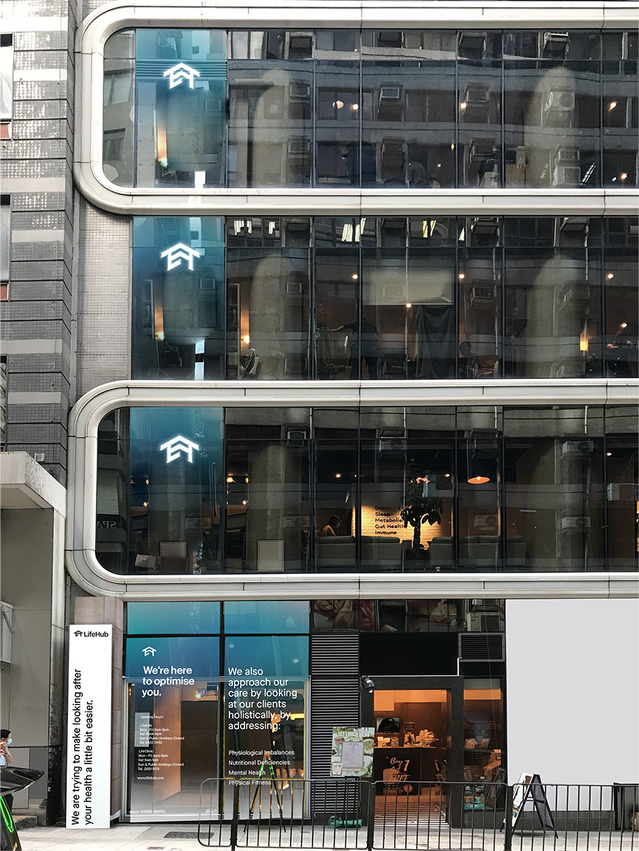
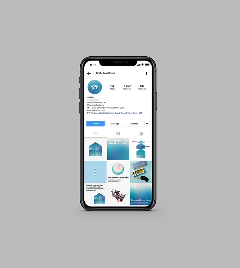
In this rebrand, we capture the essence of the brand name, LifeHub, bringing to life and creating a vibrant space where the improvement of health and well-being take center stage, where the community joins together in this upward mission. Amidst vibrancy, we’ve ensure to maintain a strong sense of professionalism and trustworthiness across the entire brand architecture.
LOGO
DESIGN
THE PROCESS
KEY ART
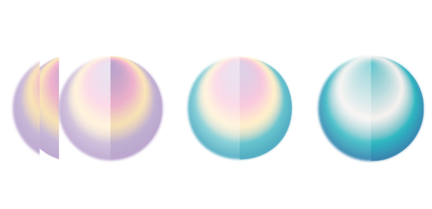
Transforming
from haze
to clarity
your well-being
hub of wellness
Transforming
from haze
to clarity
your well-being
hub of wellness

A logo design that combines four key elements into one: L and H to represent Life and Hub, a house emblem to represent the concept of Hub as a welcoming place, together with an upward arrow for ever-improvements.
Brand
Experience
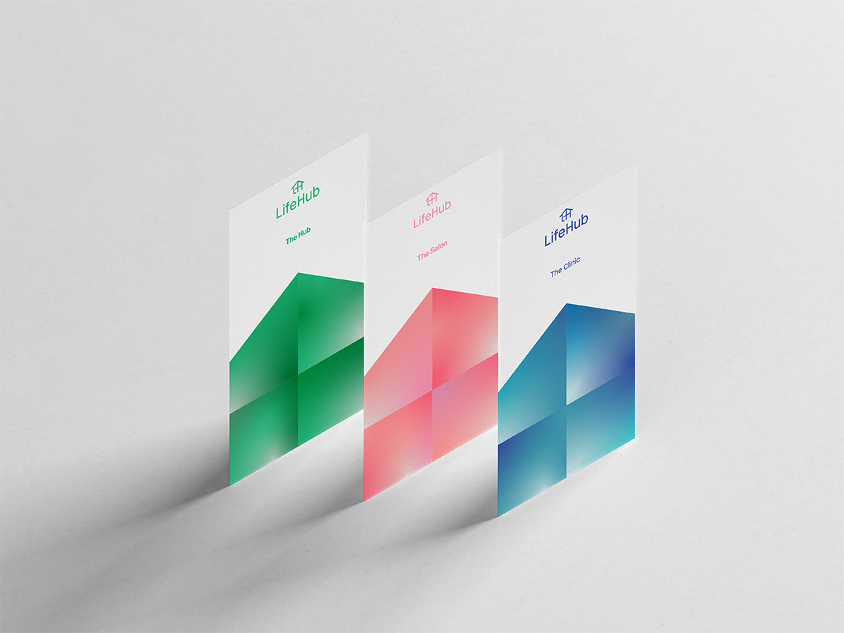
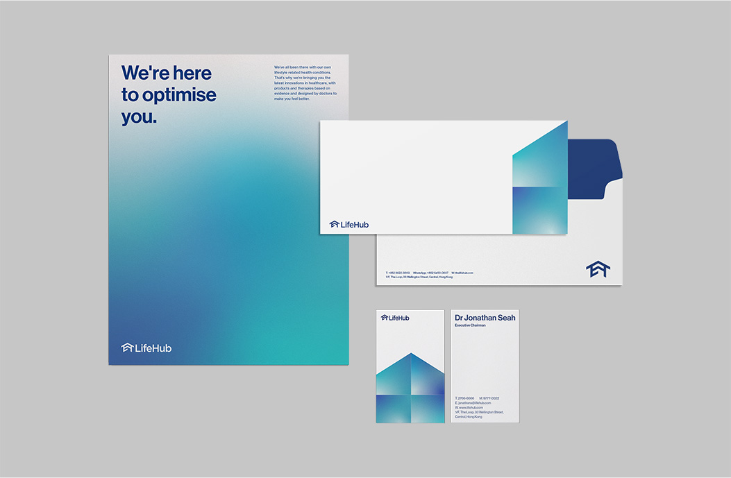
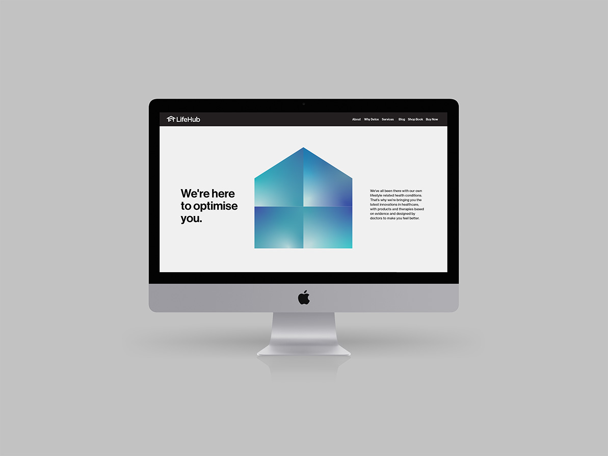
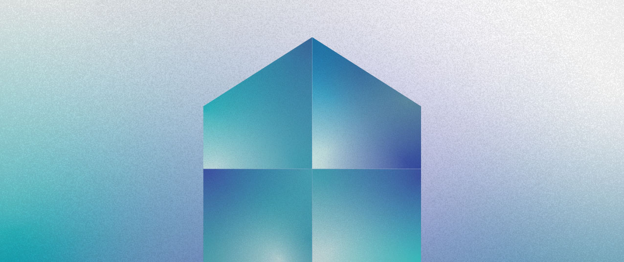
In the scientific hues of blue, spectrums of ombré come together to create the visual of a house and an upward arrow, representing a hub of wellness for upward progressions.

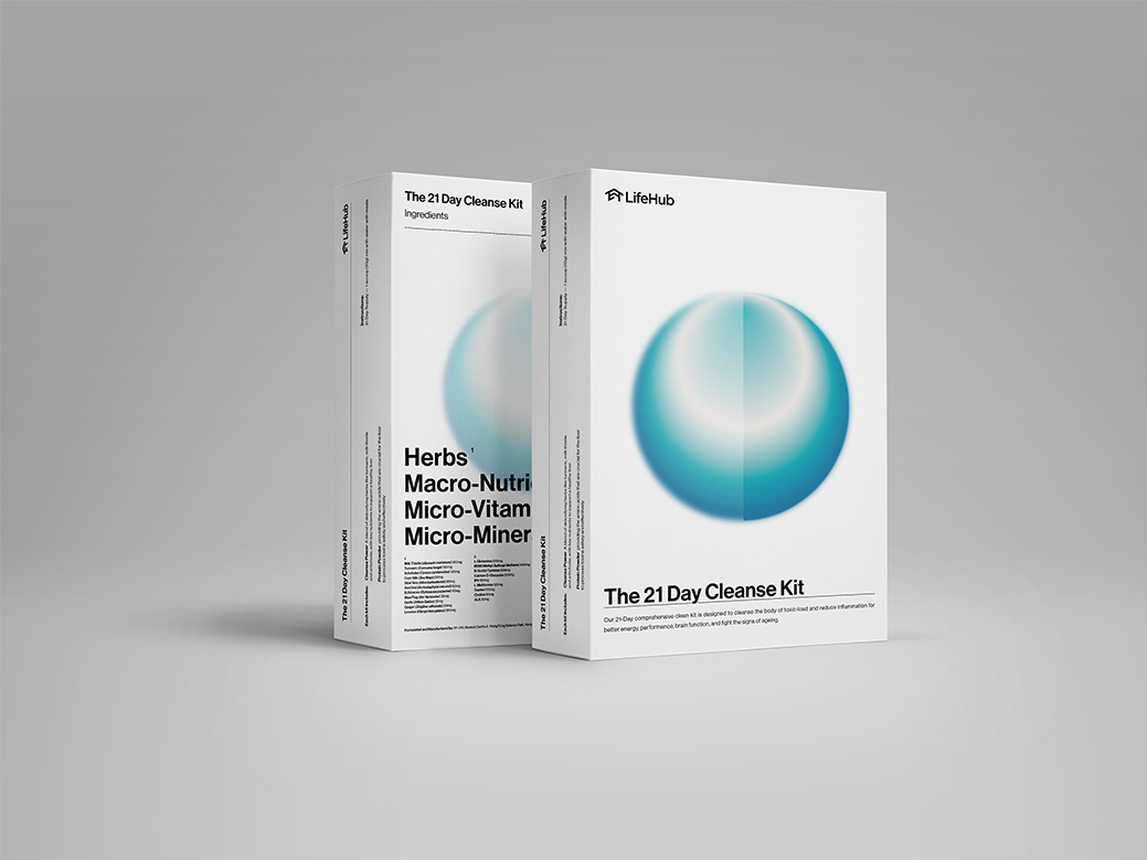
Come into full circle in the journey of health at Life Hub, here is a key visual design that renews the core and refreshes it from haze into clarity.
