Something to Savour
PIN
DESIGN
Concept
ready to
savour?
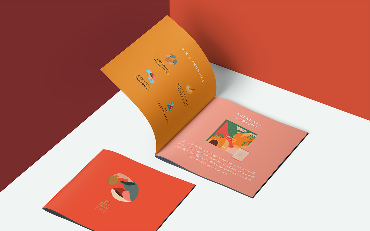
PIN is a creative cookies brand pioneering unique Asian flavours from red dates to scallion chicken, chilli shrimps and more. PIN, in Chinese is written as ‘品’, which means ‘to savour’. Interestingly, the character visually looks like three stacked cubes, hence in the logo design, we placed the English characters PIN into the Chinese character 品 to make an emblem that reads simultaneously in both languages.
LOGO
DESIGN

THE PROCESS
KEY ART

Discover a
delectable feast
in cubes
take centre stage
Discover
a delectable
feast in
cubes
take centre stage

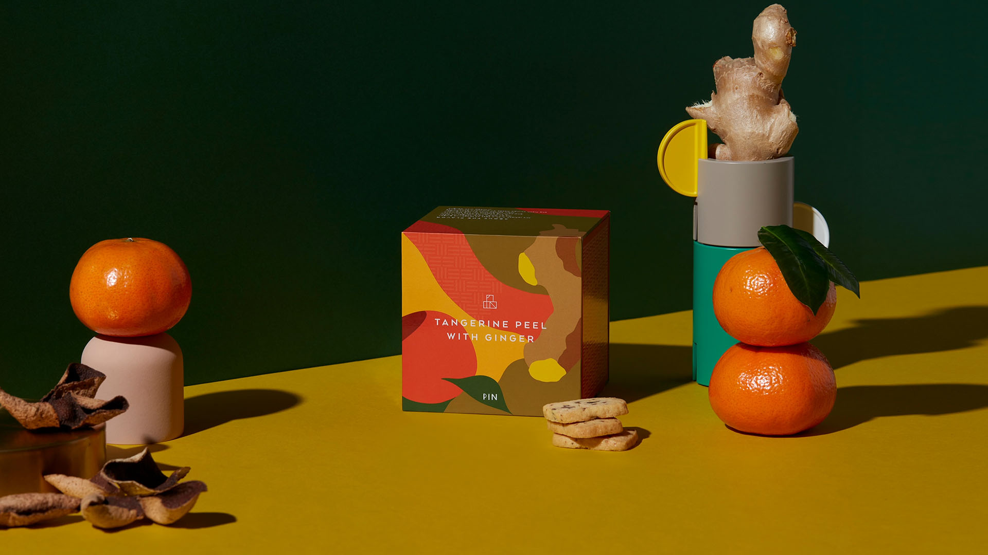
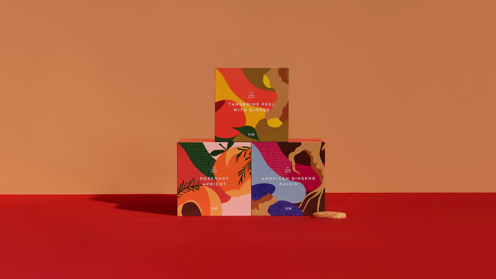
The packaging not only extends the cube concept, but also let the ingredients take centre stage to celebrate their all natural ingredient lists, whimsically illustrated and bursting in vibrancy.
Brand
Experience
The duo giftbox, stacked like a traditional Asian lunchbox, reveals the sides with a PIN pattern knitted in a bamboo style, celebrating the brand and its ties to Asian culture.

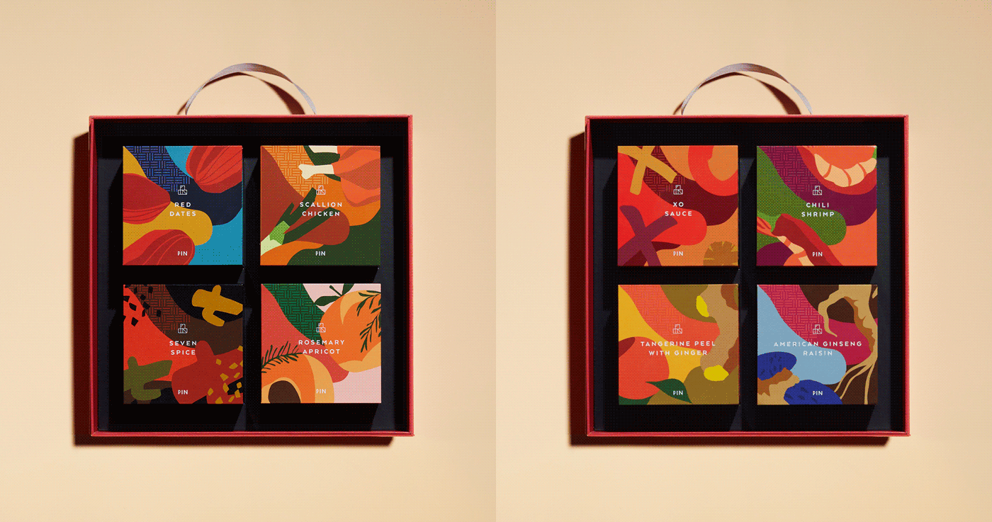
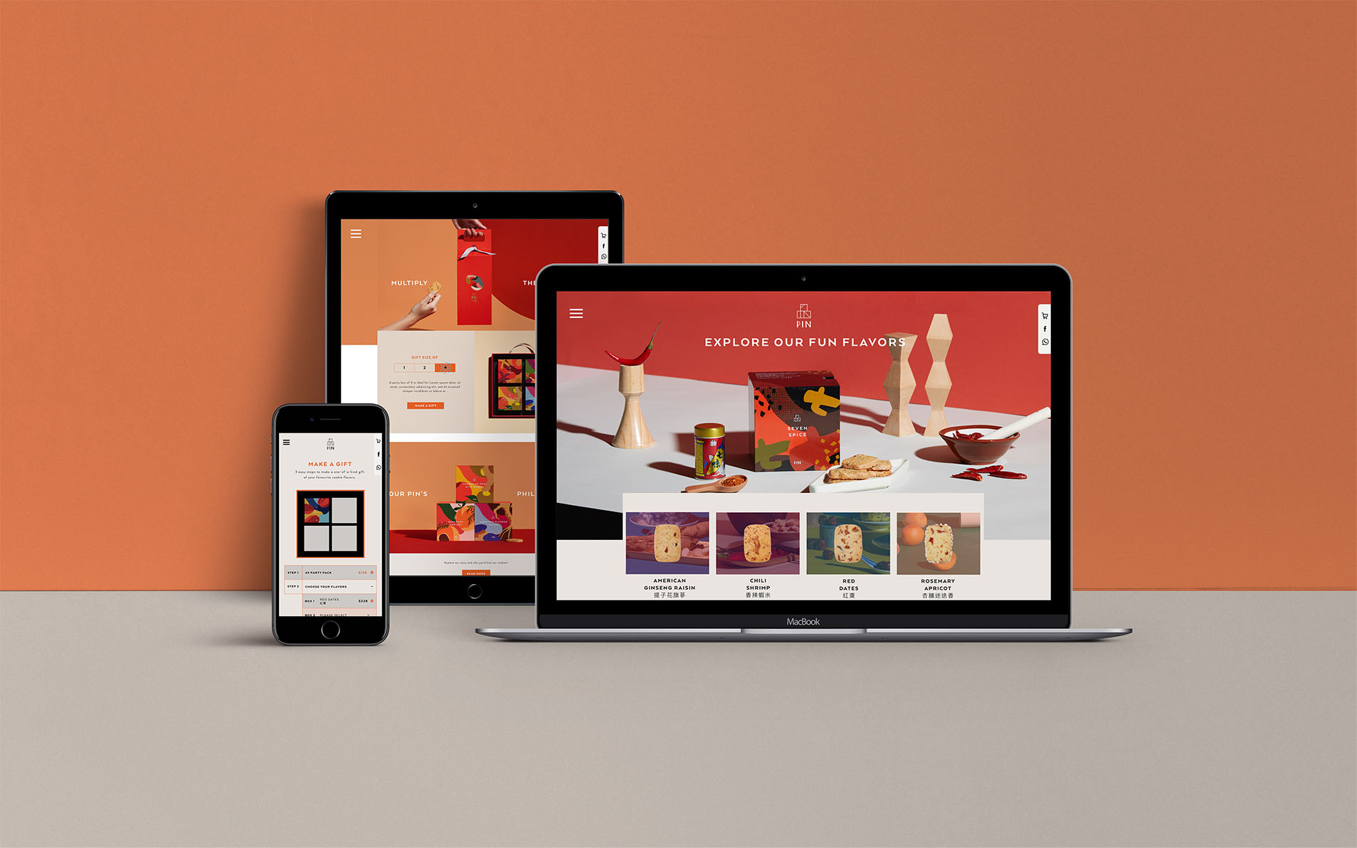
The cube concept is further extended in the 4x packaging, where similar to the building blocks of the logo, flavours come together to mix and match and create a true gastronomical journey.
