Amber
Landmark Mandarin Oriental
DESIGN
Concept
Layers of Depth
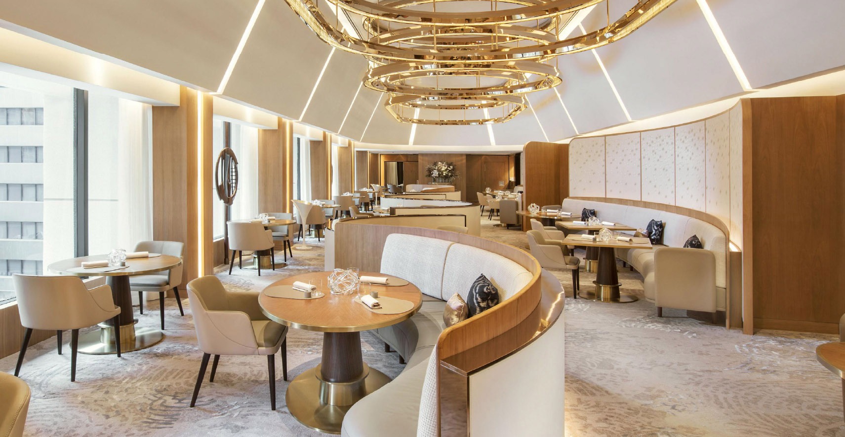
Amber is a two michelin star restaurant in Hong Kong, ranking no. 24 in World’s 50 best restaurants. After 14 years of founding, the restaurant is rebranded to align to its brand direction of 7 new courses and manifestos. Brand study reveals that the restaurant’s main target audience is female, whilst free flow creativity, graceful elegance, and organic conscience are the core of its culinary experience.
LOGO
DESIGN

THE PROCESS
KEY ART

The
7 manifestos
& 7 courses
are made in different depths
The
7 manifestos
& 7 courses
are made in different depths
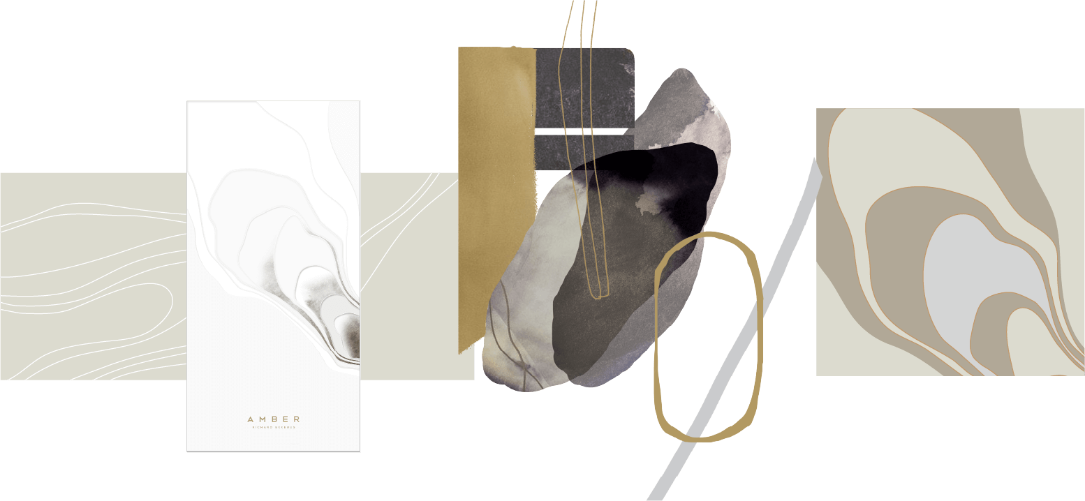
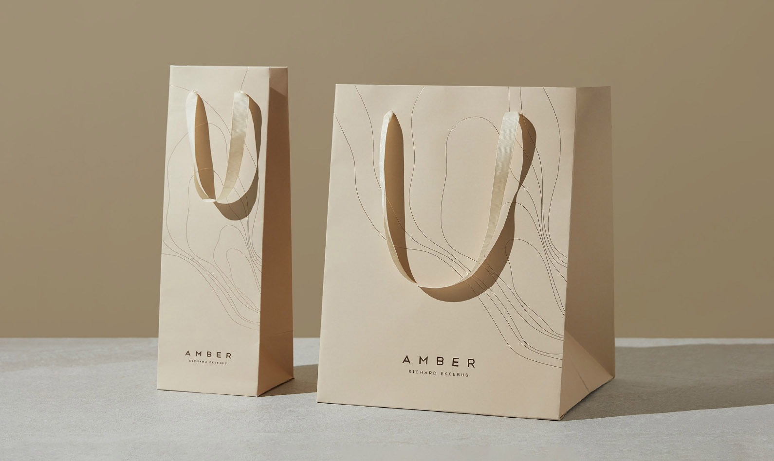
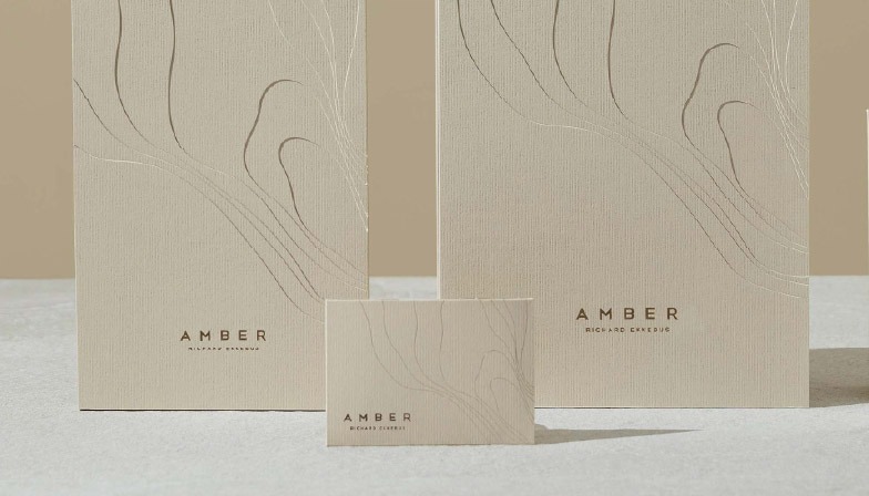
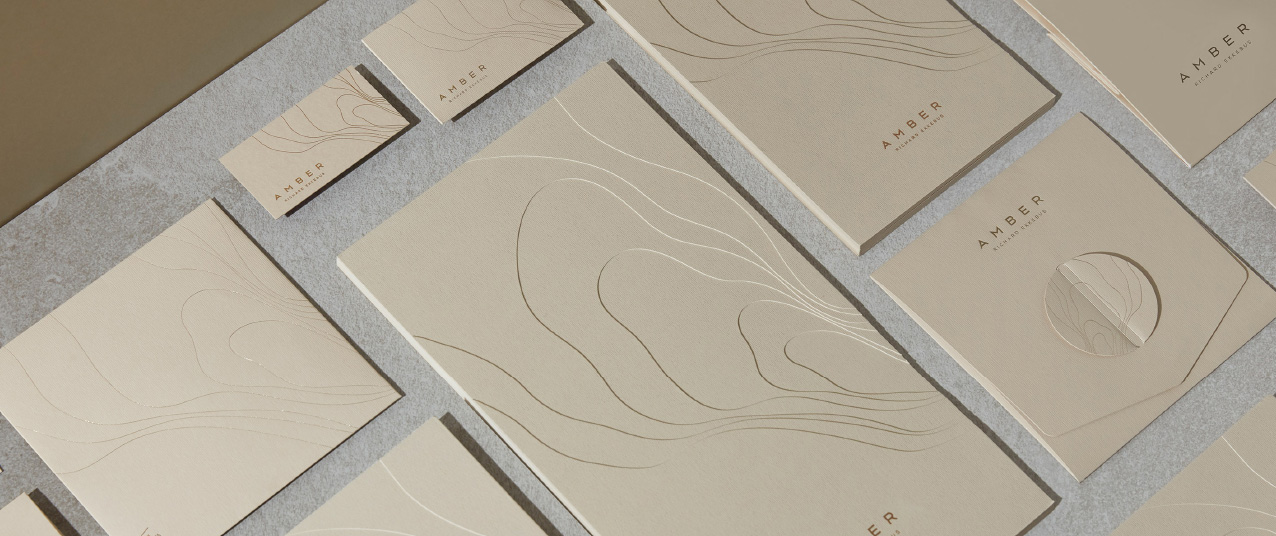
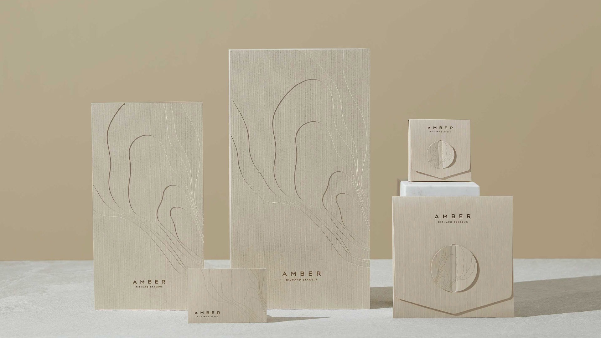
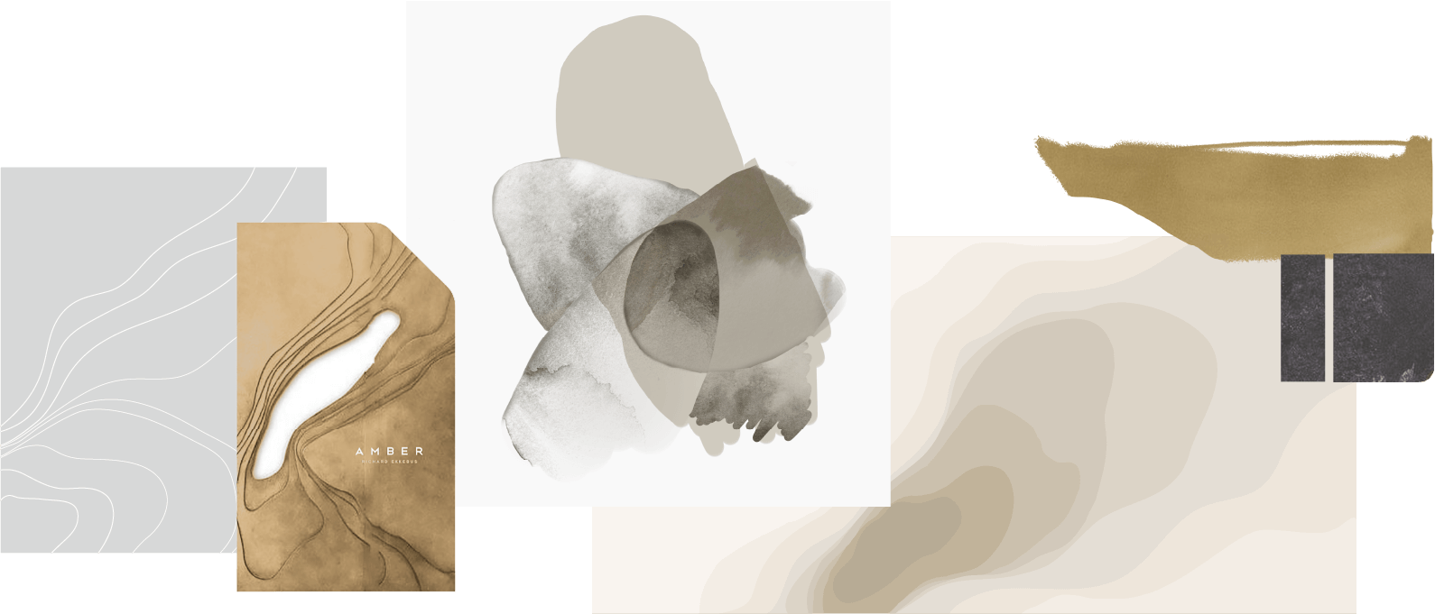
Our brand design for the two Michelin-star restaurant Amber was inspired by the progressive nature of a fine dining experience. Expressing the 7 courses and manifestos, the 7 layers of organic, free-flowing shapes are made in different depths,
visually seen and felt with an engaging tactile quality.
Brand
experience
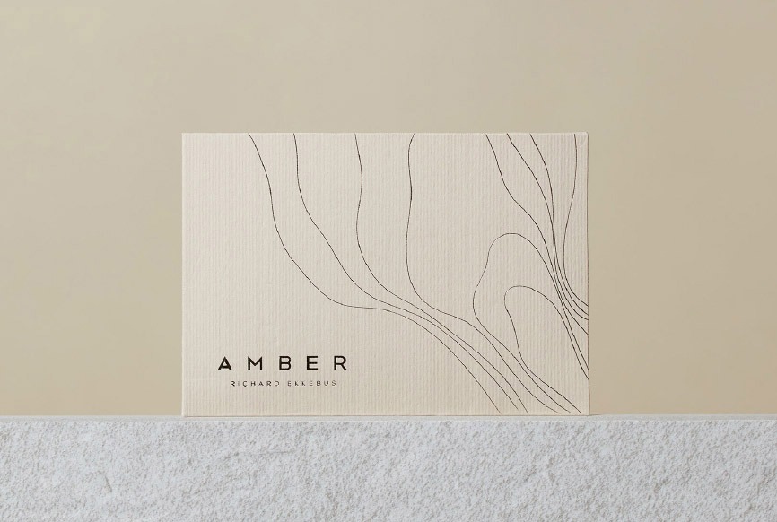
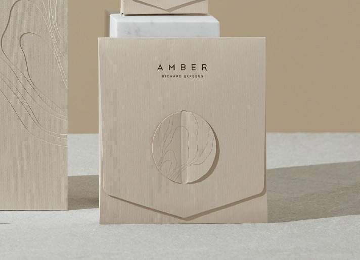
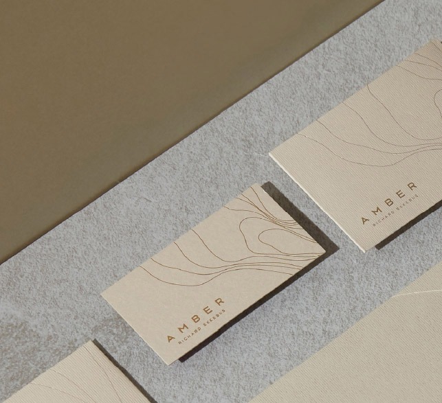
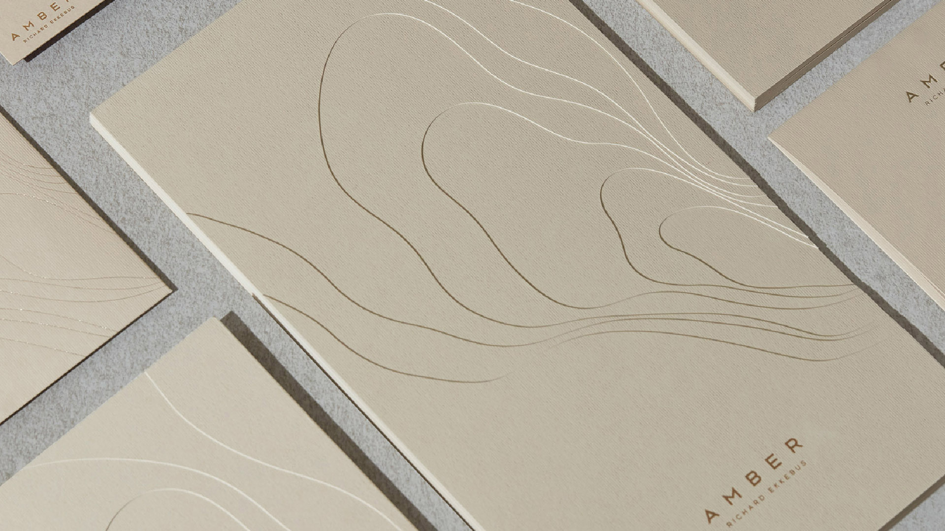
Much like the stone of Amber, as the fossilized resin from ancient forests, the free-flowing shapes of the branding design form a grounded, wood-like pattern that expresses the graceful, organic nature of the food.
In a gentle palette of beige, paired with champagne gold foil, the brand identity is extended to a series of collaterals, including cards, bags, bill envelopes, cake box & a gift of chocolate, where the center piece folds to open up to a welcoming surprise within.
